
Thursday 17 May 2012
Thursday 10 May 2012


i'm working on animating in layers now on after effects,flash and photoshop which i've been really enjoying, it's been a good way to animate without having to redo everything all the time,which i found with colouring the last ones. i don't miss as much i did when colouring before and i can focus on things alot more.

Tuesday 1 May 2012
 |
| I am excited for the future if it has this. |
 |
| I like being able to caption. |
i only just came across this man thanks to this lady (thankyou) and i think there's an awful lot of similarities between this and what i'd like to make/whats in my brain.
It made me think of this,which is in my big influence chart as it is. I'm not too sure why though.
I think the top deffinetly shows a direction i'd like to go in.
A big feature that looks like that would be fantastic.
Sunday 29 April 2012

I showed someone the main character earlier who said they imagined them a lot younger
when i explained the story to them. It made me realise i've not really developed the main character
as much as others,since i liked what i had at first.
I like the idea of her not being consistent which is possible becuase of the big puff balls being the main
feature.
Wednesday 25 April 2012


Tuesday 24 April 2012


These are some initial designs i did for a character of a reverend/religious figure who is the second
most important character. I wanted him to be a contrast of bonnie, the main character, though obviously i've made these a bit too creepy. I took bits from some of my heroes (who are pretty funny looking people) and tried to splice them in a little.


My role models are bad people.
Artist Round up


Whilst i've been designing the cast for the film, I thought i'd write whats influenced the designs.
Rather than looking at someone and taking it straight from there,i'm thinking more of things that have
been engraved in my brain as a result of liking these lovely people.
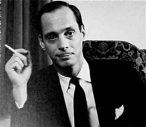
The three above are from Todd Marrone, Who's a fantastic artist working with Insane distortions,
rough edges and just completely surreal characters which i really enjoy drawing myself.
I feel like i've borrowed alot from the man.
In terms of Movement, i've always attempted a bizzarre straight ahead flow like Sally Cruikshank, who doesn't believe in drawing on model and allows characters to do insane movements which completely defy logical movement. I love that these people don't have spines.

I also love that a face can do this. i think it sums things up nicely.
I've been working hard,but decided i'd like to take this in a different direction than i have been.
I'd like to work on material for pitching the film, rather than the introduction with a fish.
I'd like to be able to show people what the ideas about and get them excited about it potentially
being made in the future. I decided to start by doing some character animation.


I'd like to work on material for pitching the film, rather than the introduction with a fish.
I'd like to be able to show people what the ideas about and get them excited about it potentially
being made in the future. I decided to start by doing some character animation.


Here's two example frames which i think shows a rough look of what type of animation i want.
I like the idea of completely distorting the characters face, and just playing with extreme squash and
stretch. It's a fun way to animate mainly, but also i think it could hold attention by being extremely unpredictable.


These are the first seven frames coloured.
One thing i learnt when doing this was that i need to learn to do some corner cutting techniques.
For one,seperating the head from the body is extremely importing when colouring in photoshop.
For one,they move at different frame rates in the original flash file,but they move together in the photoshop files. which is a shame, becuase my main intentions were to create something slower and not bouncy like my usual work. a slow distortion.
I'm quite happy with how they look when played back however.
Thursday 5 April 2012

I've been playing with the idea in my head of making the short (except the fish) in 3D,which would allow a lot more dynamic shots. I'm deffinetly not good enough at modeling yet but most of the characters I had in mind for this are extremely warped versions of real life,so it could work as a very low poly telling

an initial thought of a character.


I'm not a fantastic backgrounder at all, but I decided to use a series of rings like above that move slow and flicker which gives a good pacing. the rings pan from left to right over about 30 frames and slightly rotate.


i did 15 frames and chose only to use about 8 and put them at three frames each
which really gave a nice slow pace.
Tuesday 13 March 2012


He's creeping out.
i did a bad thing and changed brushes half way through, though when testing it, it worked perfectly. Which is great, I think the inconsistent style lets me get a bit experimenty which is great.
I changed a brush and made the consistency even lower and it looks like i wanted to with brush strokes,which for about two frames it didn't. perfect!
Monday 5 March 2012


Sunday 4 March 2012

Friday 2 March 2012
Thursday 1 March 2012


i did a quick test of animating in photoshop ( the animation is quite poor,but the cleaning up bit looks like i need it to look).
I'd animate the film sort of like this,but a bit cleaner, where i animate in flash and lasoo tool around the
clean bits and use a big brush with low opacity and low flow.
i really like the inconsistent colours which give the glimmer of the colours
vimeos quite bad at cutting off frames,so this might look shorter than it really is.


These are the roughs which I drew lines on to be able to figure out shading.
the process was long (and it really didn't turn out well) but I think it shows what
I wanted. what I wanted to work worked.
Wednesday 29 February 2012

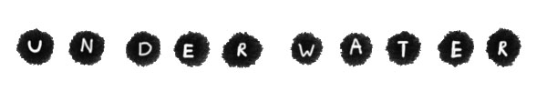
plot! which i should've written about from the get go.
It's set where people live underwater (and have for a very long time)
and each breath through a straw that pipes into their tiny homes.
people are generally quite content, not really knowing where the air comes from.
The main character, Bonnie (gracefully named by my mum) feels unsatisfied by this
and uses her straw to pull herself upwards, hoping to reach the top of the water,which
no one thinks is real.

the majority of the story is the pulling up adventure part and what happens on the way
is not something i'm sure of yet.
Subscribe to:
Posts (Atom)